Greenhouse: a site for a venture fund
Fifth of six. A fund site is read from two sides: a founder looking for whom to approach, an investor looking for where to put money.
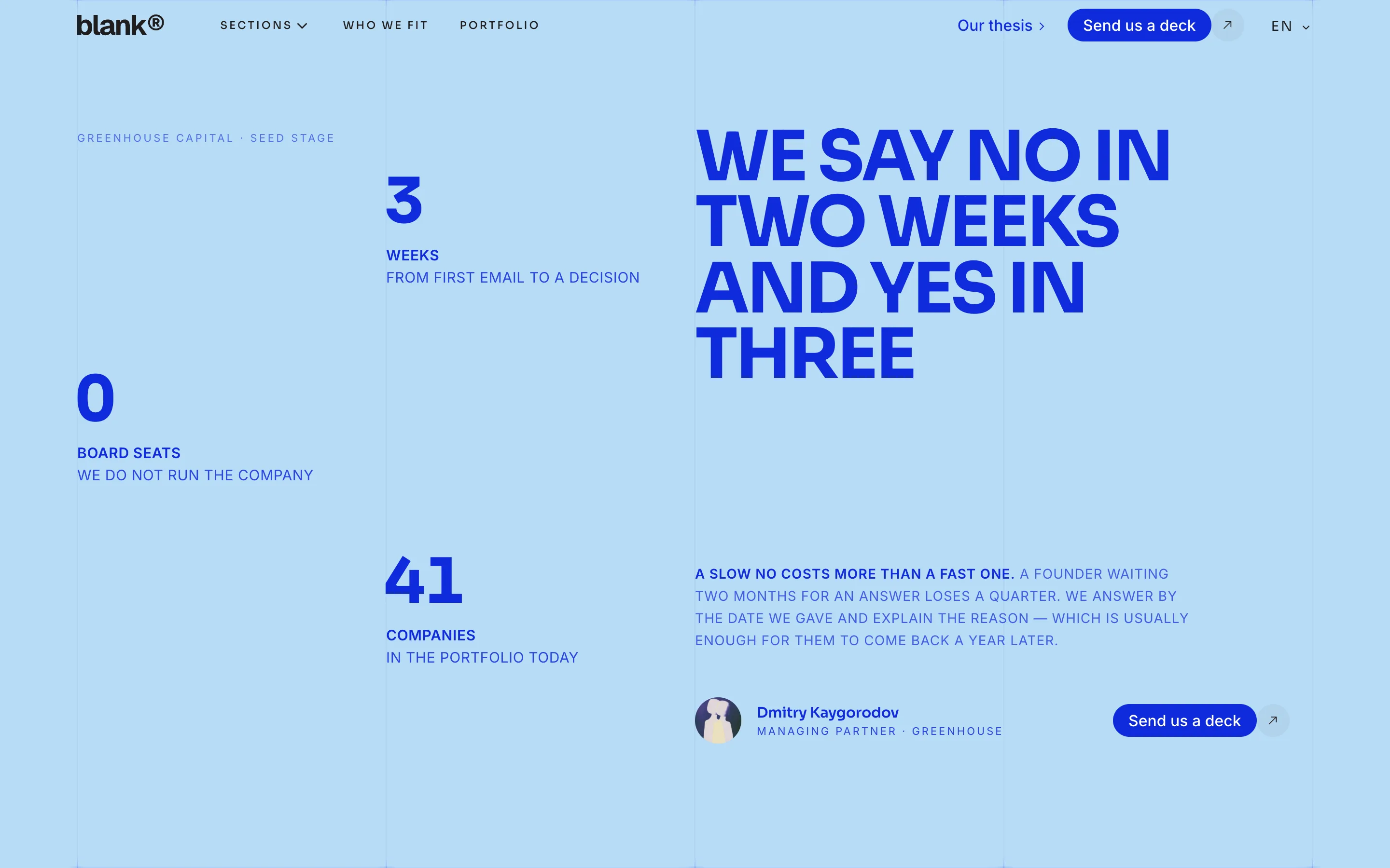
Greenhouse is an early-stage venture fund. Two people open its page: a founder weighing whether to write, and a partner weighing whether to commit. You cannot address both the same way, and making two pages means nobody finds one of them.
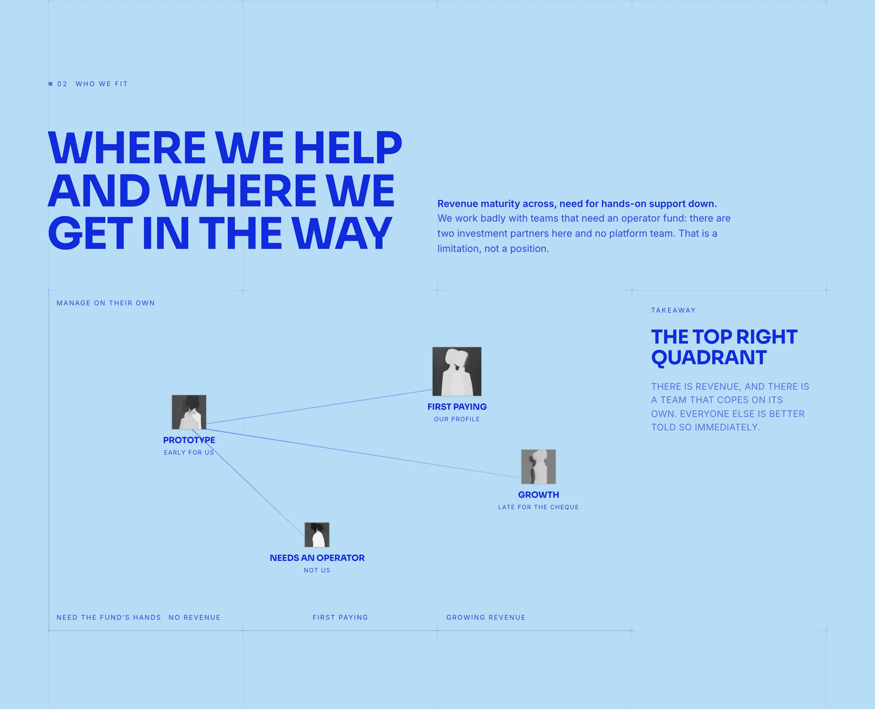
The answer is order. `HeroSplit` opens with a split first screen, then `Statement` puts the fund's thesis in one sentence. `PersonaMap` places kinds of founders on a plane: the reader finds themselves before they start reading terms.
Where politeness ends and specifics begin
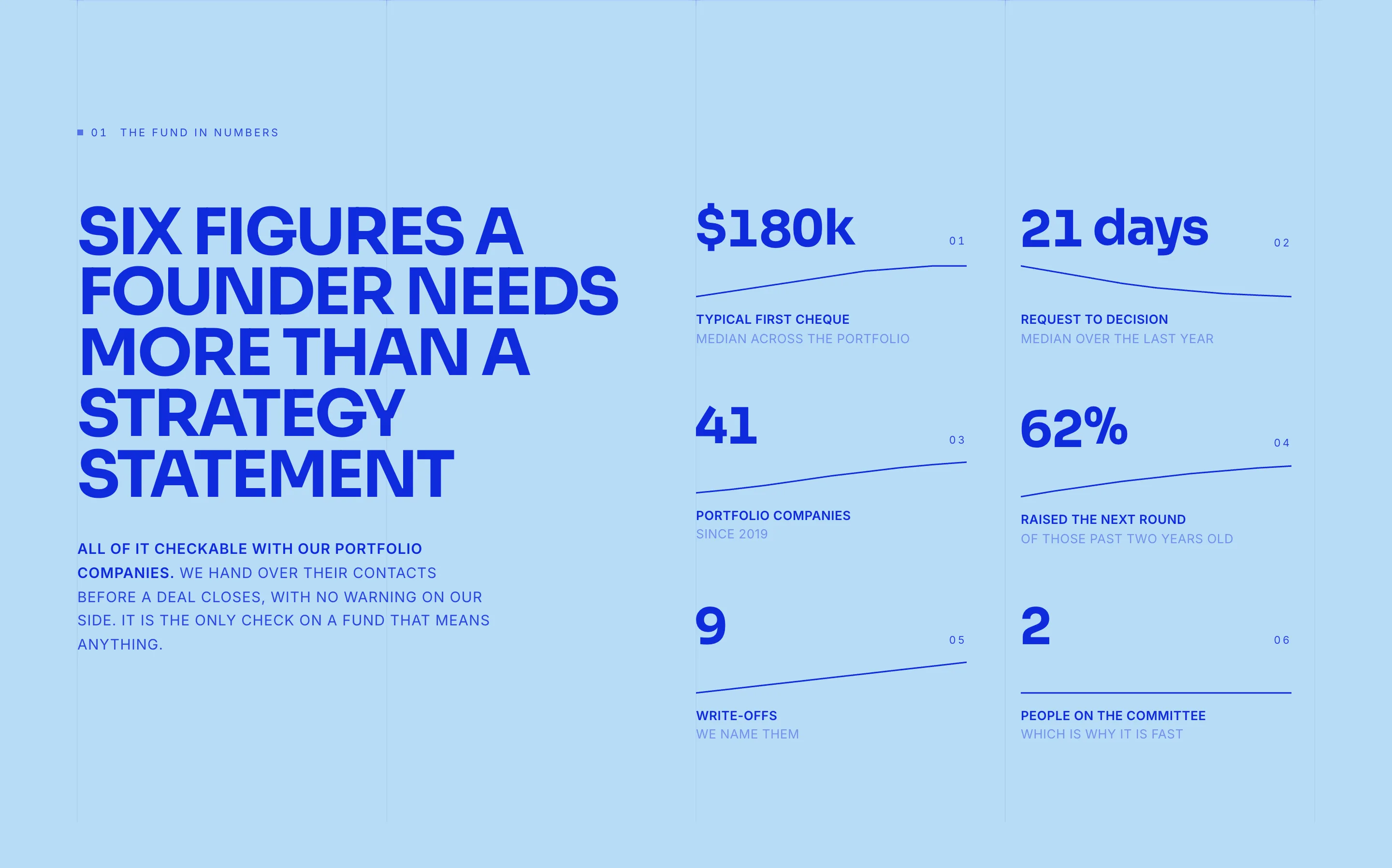
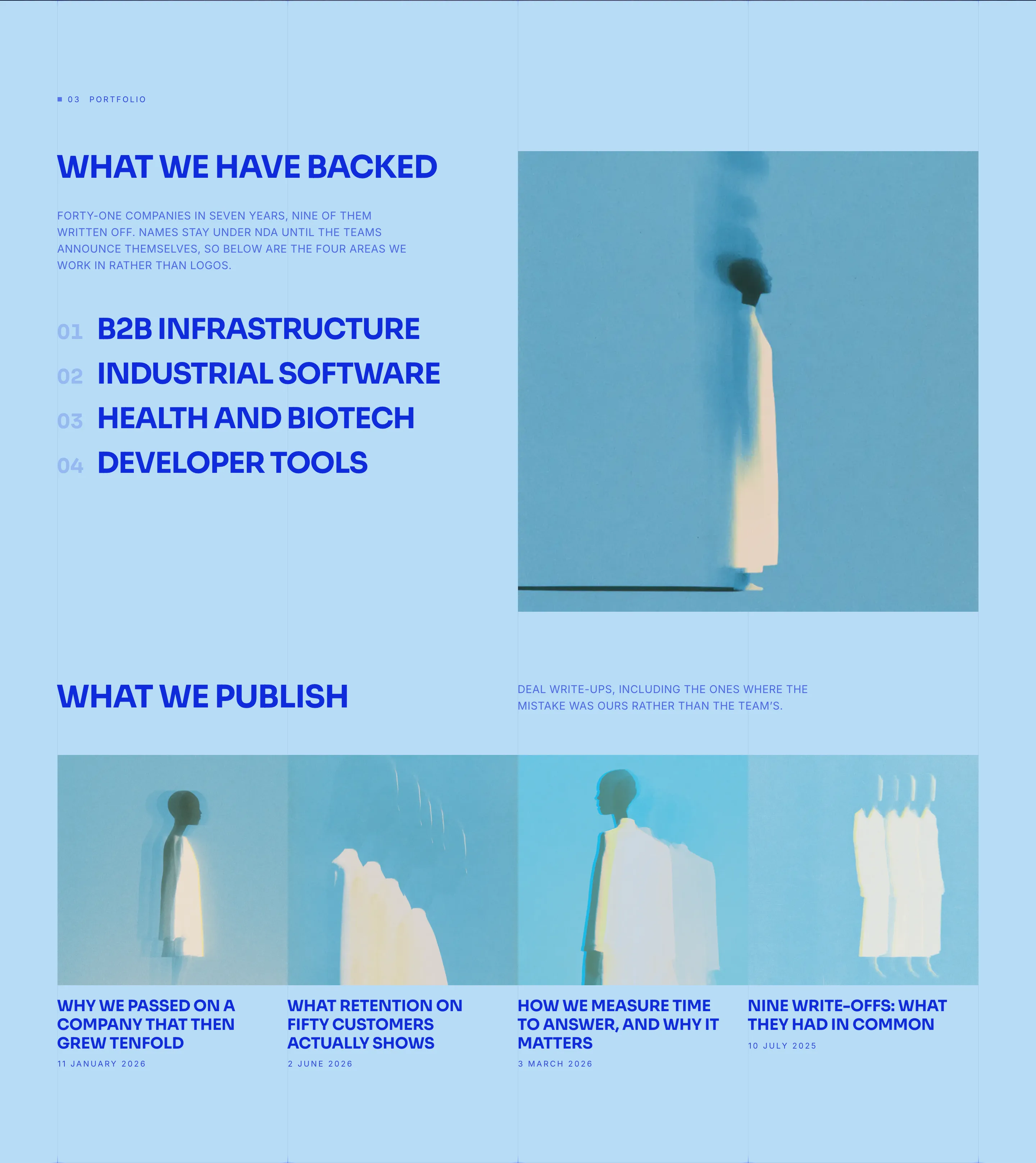
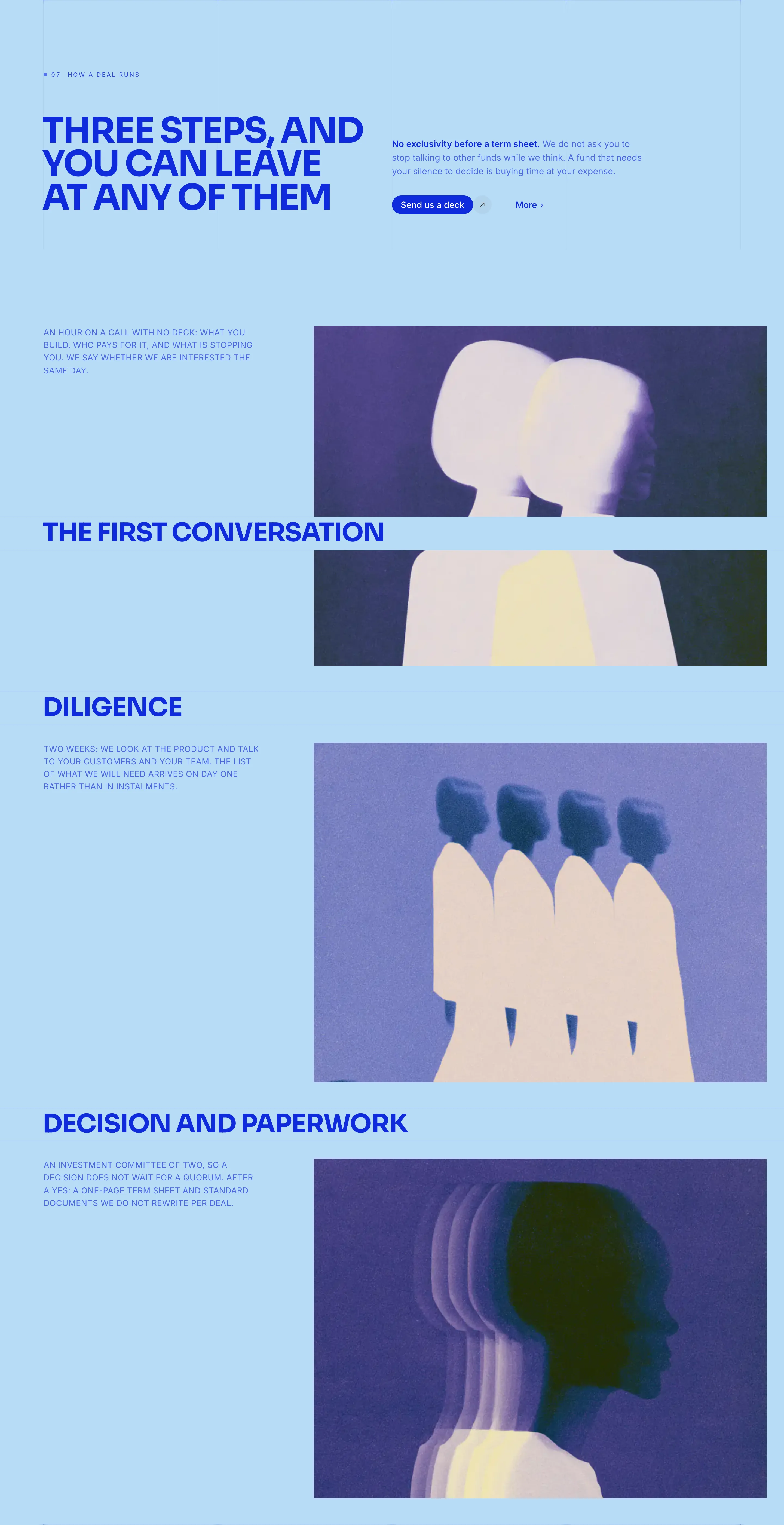
`MarketSizeSlide` and `StickyStats` are the two sections with numbers, and this is the one place numbers belong: a fund is obliged to speak in sizes. `StickyTabs` walks the stages of working with a portfolio company, `FocusSplit` holds one spread to one argument.
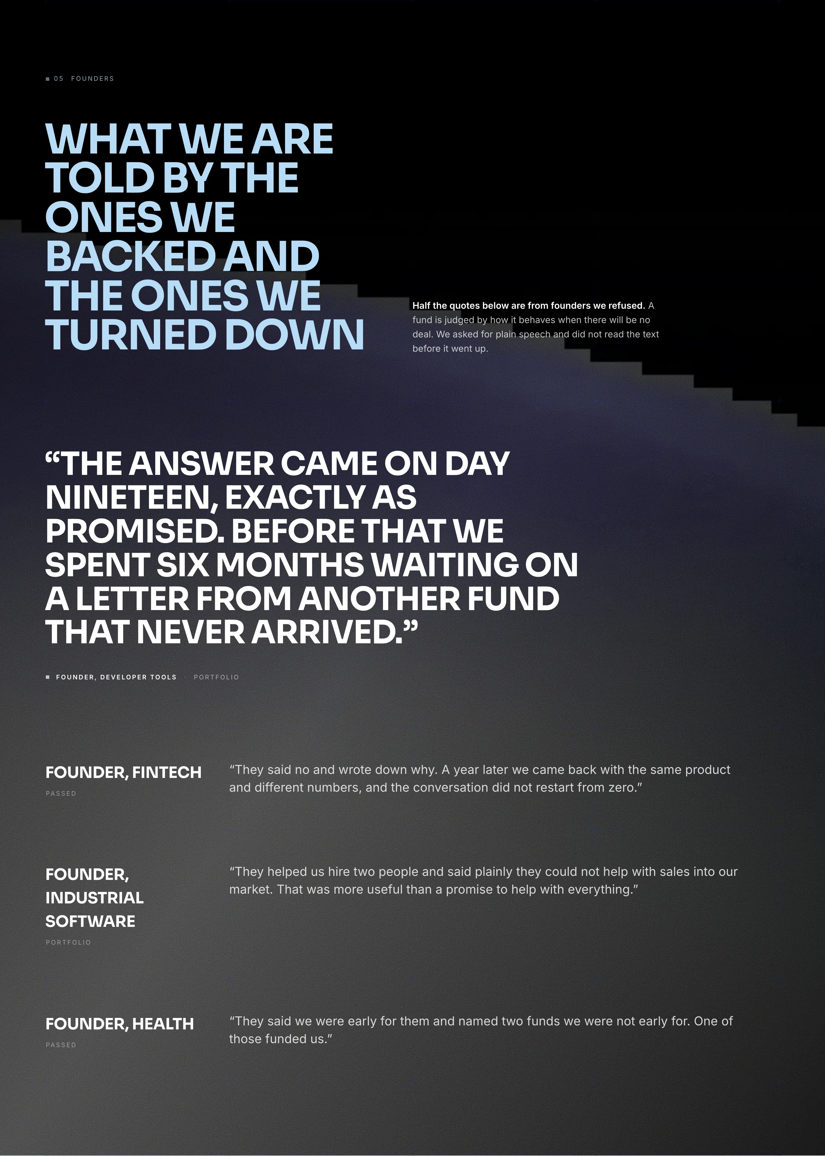
It closes with `TeamGrid`, `PullQuotes` and `Faq`. In venture the team is the product: the money is identical everywhere, the people and how they behave in a bad quarter are not.
What this build demonstrates
A saturated blue primary on a light blue surface, with ink in the same blue. It is the rare case where ink is not black: the pair is computed and passes on contrast, and the page gains a cast that neutral grey typography never gives.
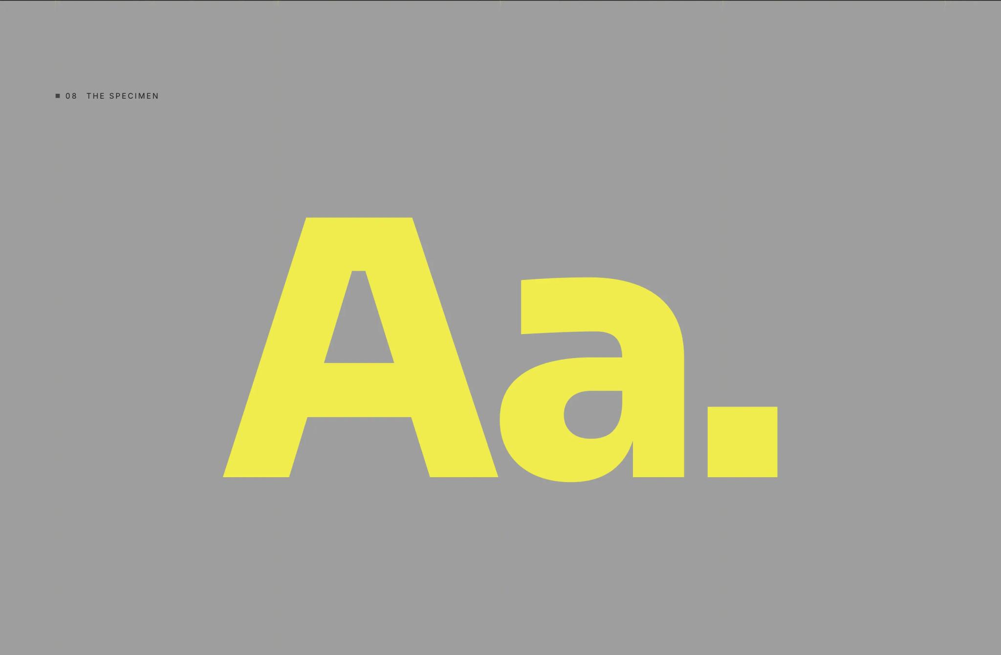
Both faces are grotesques of different width and character. The site is complete in two languages: for a fund the English-speaking half of the audience is not "later", it is day one.
More from the blog
Two, never more. A longer strip turns the end of an article into a second index page, and the reader has already chosen once.